VIU

VIU

2023

2023

2023

Client

HUB International

Problem

HUB International approached us with a challenge to explore whether a mobile app was necessary to help reshape how people engaged with insurance. We believed that an app could be a good companion to the already developed Web platform that would assist users throughout their insurance journey, but before we went down that road we first needed to validate it as a real business opportunity.

Research Insights

Approach

We kicked off our research with a competitive analysis and user interviews. Our aim was to determine whether this product was worth building, and if so what users would expect from it. Our findings revealed that several competitors had already begun expanding into the mobile space in different ways. While users provided valuable feedback and shared some of their struggles with buying and managing their insurance claims, they also expressed concerns about security when it came to accessing their sensitive insurance information via mobile devices

To make VIU more personal and helpful, I focused on four key features that simplify insurance and build user trust:

  • Smarter onboarding to capture key info through intuitive prompts, making personalization easier.

  • Educational content tailored to each user’s location and needs, reducing confusion and building confidence.

  • Tap-to-define glossary that breaks down insurance jargon right when and where users need it.

  • Proactive AI tips to spot coverage gaps and guide smarter decisions in real time.

Process

1) Person information allows us to be a better educator
2) Allows us to make suggestions that help to simplify the insurance process

Adding ways to capture information from users helps us move towards the goal of the personalized, helpful and educational guided experience through out the app. The more we know the more helpful we can be.
So creating a more robust information capture system was needed. Two places we could beef this up. The first place was during onboarding the second place was using inline information capture events that would be a gentle nudge for you to share info with us.

Research Insights

We kicked off our research with a competitive analysis and user interviews. Our aim was to determine whether this product was worth building, and if so what users would expect from it. Our findings revealed that several competitors had already begun expanding into the mobile space in different ways. While users provided valuable feedback and shared some of their struggles with buying and managing their insurance claims, they also expressed concerns about security when it came to accessing their sensitive insurance information via mobile devices

User Goals

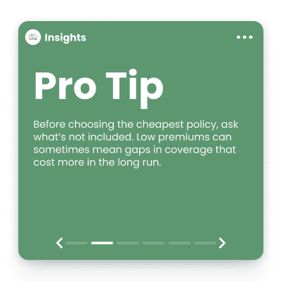
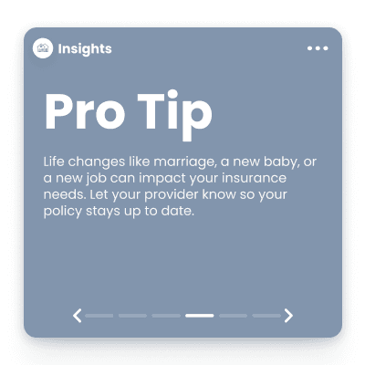
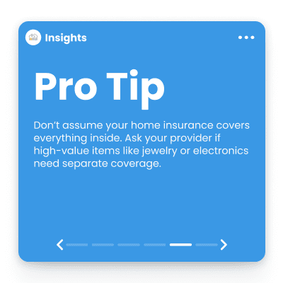
  • Provide education and Transparency

  • Simplify the insurance process

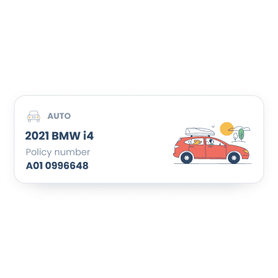
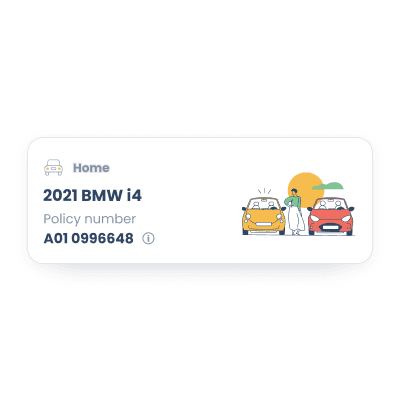
  • Make information easy to access
    Users mentioned that they often struggled with insurance jargon and wanted to feel more confident when making decision about purchasing insurance. They are looking for guidance and education, as well as a way to access their information with ease.

Approach

To make VIU more personal and helpful, I focused on four key features that simplify insurance and build user trust:

  • Smarter onboarding to capture key info through intuitive prompts, making personalization easier.

  • Educational content tailored to each user’s location and needs, reducing confusion and building confidence.

  • Tap-to-define glossary that breaks down insurance jargon right when and where users need it.

  • Proactive AI tips to spot coverage gaps and guide smarter decisions in real time.

Process

Outcome

We conducted usability testing in stages, starting with the core experience and gradually introducing new features. This allowed us to validate each addition and confirm it added real value. Positive feedback helped shape a phased rollout plan.

We began by building a strong foundation that matched the web platform’s functionality, while setting up the infrastructure for future features like a more robust information capture system to support personalization. Phase one focused on faster access to key documents, educational blog content, a central hub for policies, and a design system to support consistency as the product scales.

What I learned

Complexity is a barrier people look to technology to overcome, especially in industries like finance, legal, healthcare, and insurance where users often feel intimidated. In these spaces, the products we build should act not just as tools, but as educators offering users not only the “what” (such as dense policy details) but also the “why” and the “how” to make informed decisions. Personalization plays a critical role in this. Users are drawn to experiences that feel tailored, intuitive, and predictive of their needs. When a product not only meets the moment but supports the broader journey, it becomes more engaging, more trusted, and ultimately more adopted. People want more than convenience they want clarity, confidence, and guidance. The more a product offers that, the more likely it is to earn lasting engagement.